Evocative abstraction using primarily blue and white, with touches of other colors on canvas board.
Continue reading “Perceptual Study in Blue and White (2003)”
This section showcases small paintings. Since the purpose of this website is to archive Amy Ione’s work from the 1970s to the present, both successful and less successful work is displayed. For more information about any of the works, click on the caption below the painting or send an email.
Evocative abstraction using primarily blue and white, with touches of other colors on canvas board.
Continue reading “Perceptual Study in Blue and White (2003)”

Rainy Day Monday is a small, compact painting created with both oil and ink. This combination juxtaposes some measure of painterly richness (from the oil) with sharper, linear, and tighter elements (from the ink). Perceptually, interweaving the media this way offers a surface with textural contrast; it is one in which boarder color fields play against the fine detail.
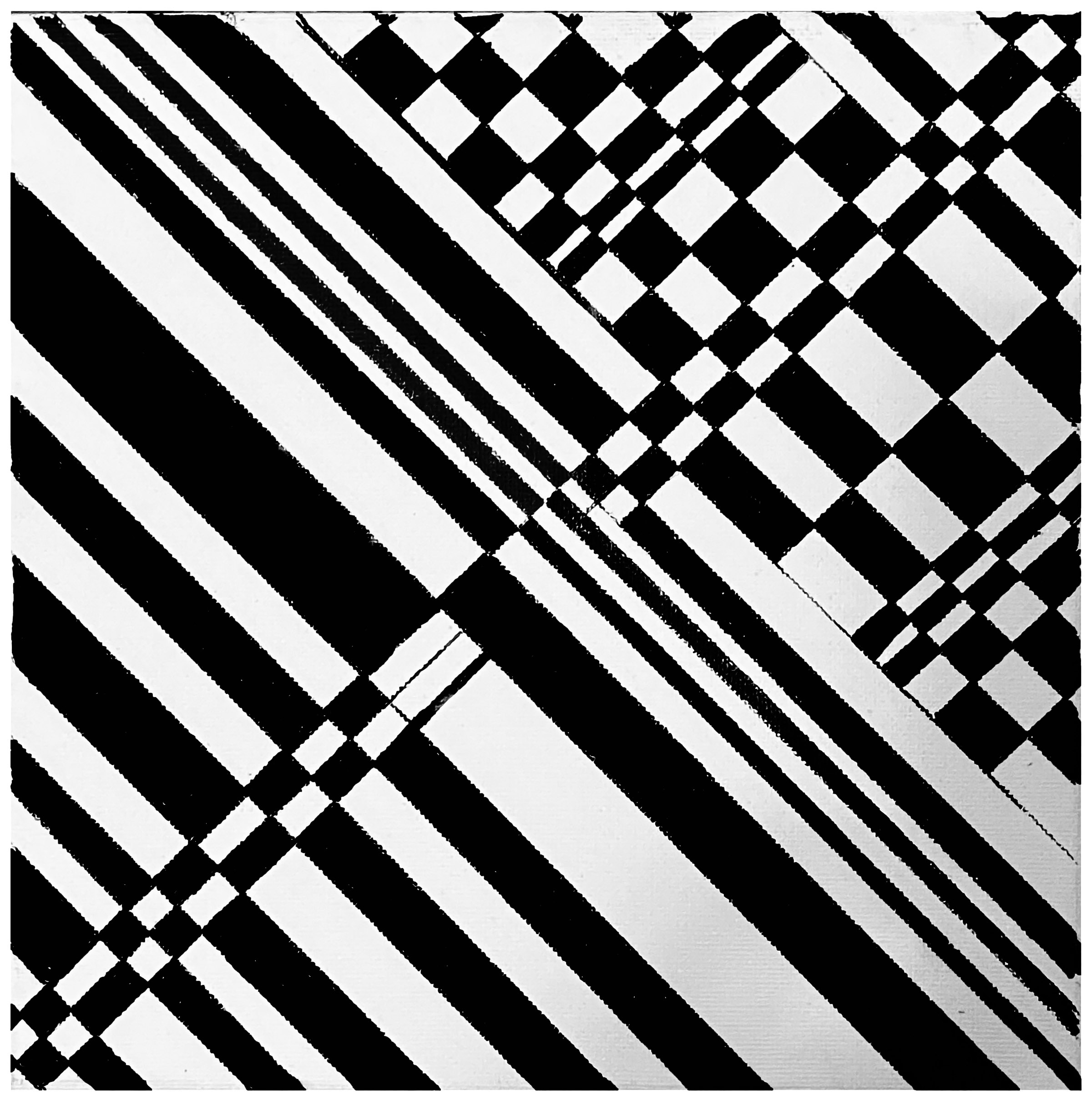
This black-and-white pattern was a perceptual experiment intended to convey the social dissonance in 2025. In it, the black, white and shades of gray play off the horizontal lines and a diagonal cue to create an optical illusion. At the same time, they point to the various ways in which life, society, and even ideas about what reality is are uncertain or unpredictable. Continue reading “Uncertainty and Dissonance (2025)”
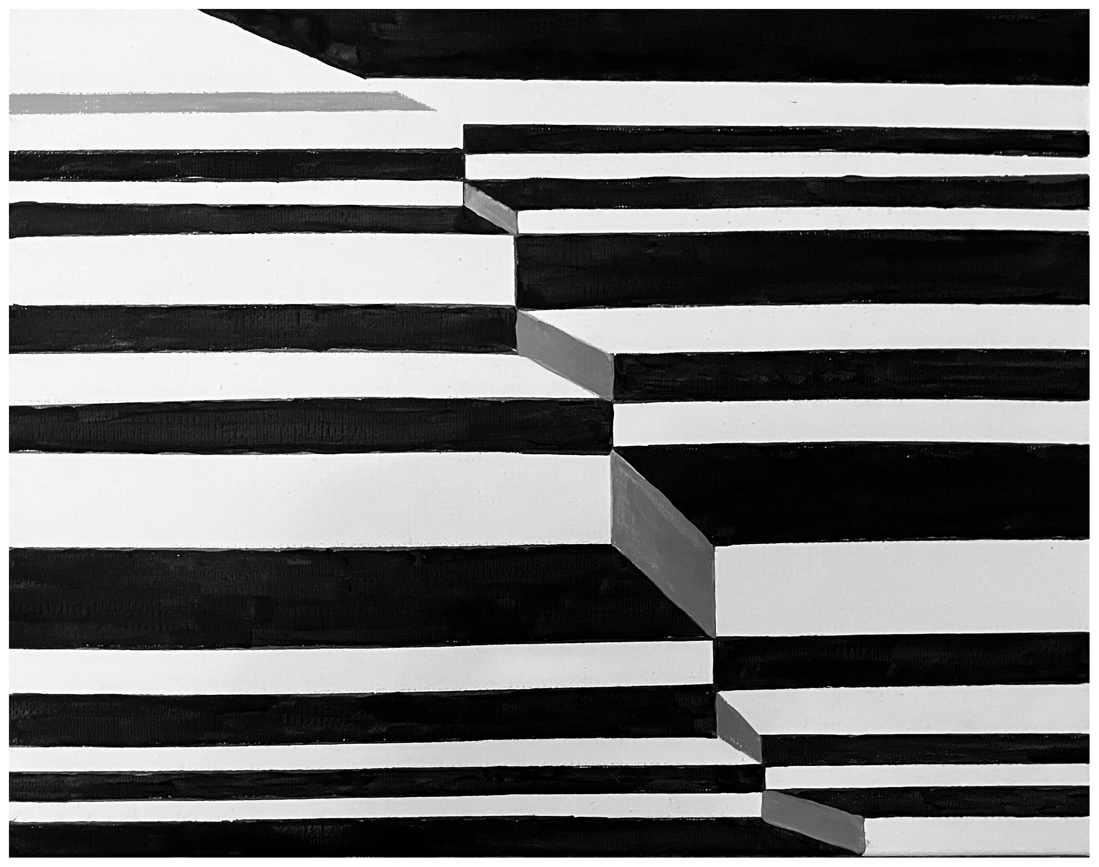
Adding Dynamic to a Black-and-White Grid transforms a basic pattern parallel lines into a vibrant exploration of movement and contrast, using only the fundamental opposites of black and white to make its statement. The contrast in this monochromatic work does not produce a rigid image because the bold introduction of diagonal and intersecting lines are used to add energy to what began as an very static form. Thus, the composition as a whole balances the uniformity and formal qualities of a simple pattern with the disruption, evolution, and transformation within human life. Continue reading “Adding Dynamic to Black-and-White Lines (2025)”

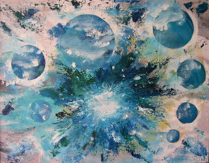
This composition, created with an airbrush and templates, operates in a liminal zone between abstraction and suggestion. This zone, combined with Untitled 33940‘s colors, evokes cosmic, cellular, or even embryonic origins without anchoring the viewer to any single narrative. In other words, ambiguity is central to this small work’s power, which is built around and reinforced by a constellation of softly luminous spheres, some sharply outlined, others dissolving into mist. Continue reading “Untitled 33940 (2023)”
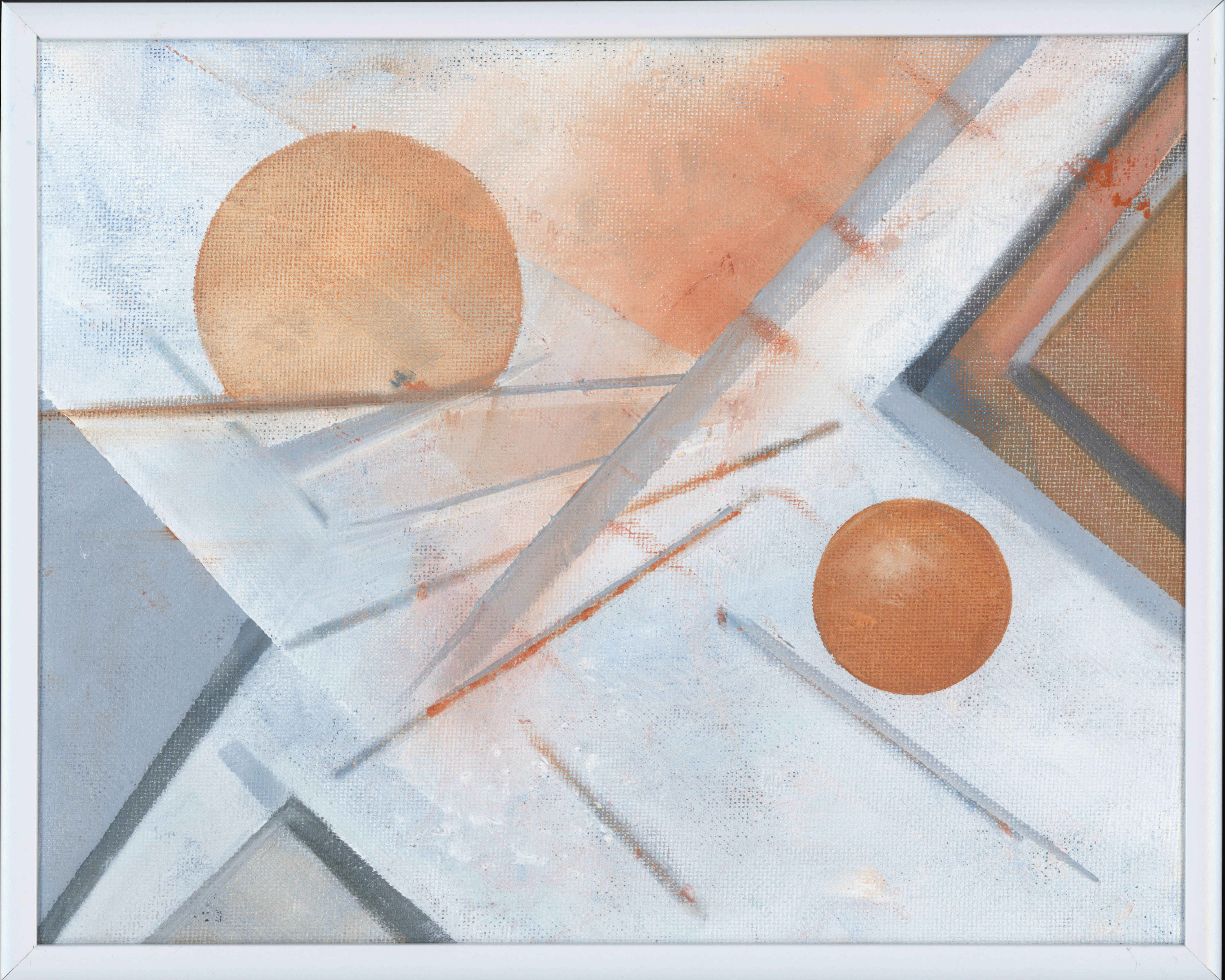
This work is another example of my examination of perceptual ambiguity through geometric abstraction with its diagonal thrust and dual circular anchors generating a visual rhythm that suggests both motion and equilibrium. Diagonal lines and dual circular forms animate this composition, creating a sense of tilt and tension. Continue reading “Slope (2022)”

The Mirror is a compelling meditation on visual cognition and the layered nature of perception. Dominated by a central white orb—reminiscent of both a mirror and an eye—the painting orchestrates a dynamic tension between structure and spontaneity. Angular lines slice through the composition, while expressive brushstrokes in slate gray, red, and blue punctuate the surface, evoking both emotional resonance and neural complexity.

Like Pandemic Study #1, this evocative oil painting explores the interplay between darkness and illumination through a monochromatic palette. Using black and white only, the painting demonstrates how these contrasting values can generate an almost chromatic luminosity despite the absence of color. The composition investigates the optical phenomenon whereby white light contains the full visible spectrum, while challenging conventional notions of black as merely the absence of light. Continue reading “Pandemic Value Study #2”
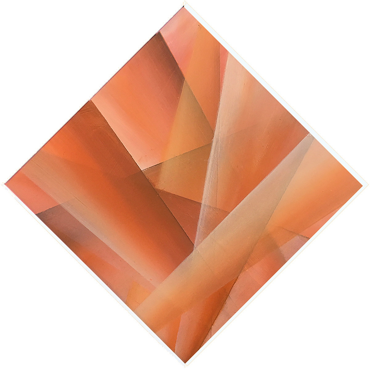
This small panel uses earth colors to capture both the feel and colors of nature. Overall, its chromatic elements not only display the earth, they also capture an element of light–perhaps sunlight–that serves to enhance the viewer’s visual experience.

This intimate tribute to Paul Klee’s 1937 Blue Night (Blaue Nacht) is a part of a diptych, with Homage to Paul Klee (Blue Night) #1 comprising the other panel. Both works celebrate Klee’s fascination with how one can manipulate abstract possibilities in both art and music. Therefore, it too reflects a fusion of abstraction and poetic nuance. Together, the two 8-inch panels of the diptych demonstrate how Klee’s musical methodology can manifest through contrasting formal vocabularies, one staccato and architectural, the other legato and organic. Continue reading “Homage to Paul Klee (Blue Night) #2 (2018)”