Tracing the Contours of Art, Science, Technology and Cognitive Neuroscience
Category: Paintings
This section showcases paintings. Since the purpose of this website is to archive Amy Ione’s work from the 1970s to the present, both successful and less successful work is displayed. For more information about any of the works, click on the caption below the painting or send an email.
This work is a continuation of my investigations into the correspondences among color, form, and visual dynamic in terms of their psychological and perceptual effects/affects. Using an intuitive and poetic approach, the work aimed to formulate an abstract language that would cause strong emotions in the same way music does. Continue reading “Process and Creation”
Although black, white and shades of grey, this painting was inspired by Josef Albers’ studies of color relationships, thus the name: Homage to Josef Albers.
Albers (1888-1976), a German-born American artist and educator who is considered one of the most influential 20th-century art teachers in the United States.
Cubistic (2017) is a Necker cube study. The work is a perceptual oil painting that explores visual ambiguity and cognitive interpretation through geometric abstraction. Its starting point was the concept of the Necker cube—an optical illusion first described by Swiss crystallographer Louis Albert Necker in 1832. Continue reading “Cubistic (2017)”
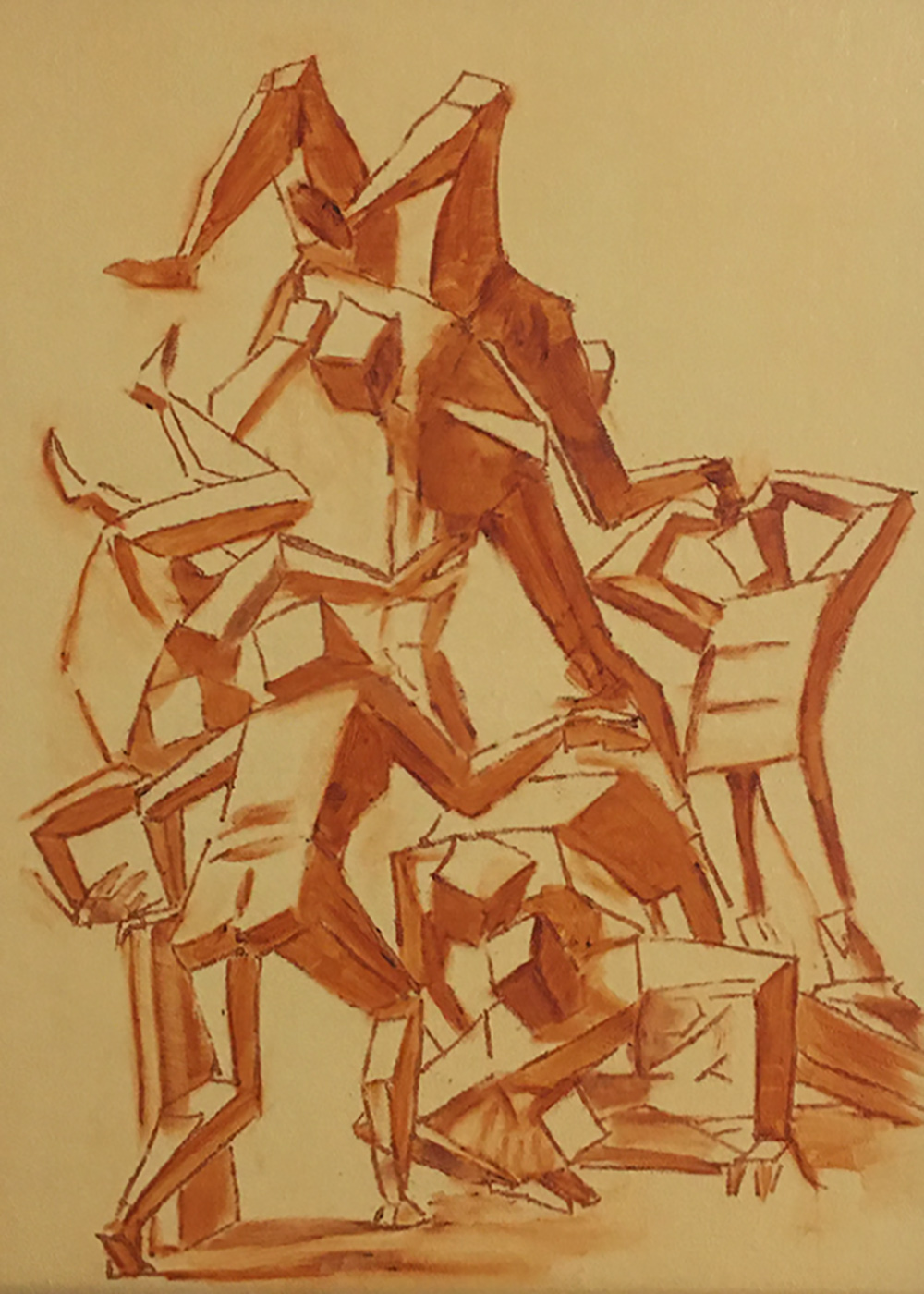
Homage to Cézanne is actually based on how his approach to perceptual painting influenced my work, not Cézanne’s style. The photographs below are reference photos used. The face top left in the large drawing is Cèzanne’s. The figures on the left are based on various photographs of him. The origin of the faces on the right is unclear at this point. Continue reading “Homage to Cézanne (1987)”
Luca Cambiaso (1527-1585) was a Genoese School painter and draughtsperson. He visited Rome at least twice and Michelangelo was a powerful influence on the massiveness of his figures, although a softness of modeling perhaps has more in common with Correggio. Because some of his figures are constructed using simplified cubic shapes, they look remarkably modern.
Pisces (1985) was a pivotal piece. It incorporates the Pisces symbol into the composition, and is not a narrative work in any way. Its vibrancy comes about due to the use of spirals and patterning—and it built on my discovering that creating lines with different sized pen widths added a perceptual musicality. This discovery is discussed on The First (Pisces)page.
Space Study #1 exemplifies my ongoing investigation into the intersection of art, science, and visual cognition. The painting’s layered hues—derived from a limited palette of red, green, and white—demonstrate how subtle shifts in chromatic balance can generate a sense of depth and spatial ambiguity. Continue reading “Space Study #1 (2002)”
Gradations and Imperfections is a circular panel animated by a dynamic checkerboard pattern, rendered in a palette of rich blue and creamy beige squares. Perceptually, it’s diagonal grid evokes a sense of movement and playful disruption. Each square and stripe varies subtly in hue and texture, inviting close examination of the painting’s hand-painted qualities. Continue reading “Gradations and Imperfections (2025)”
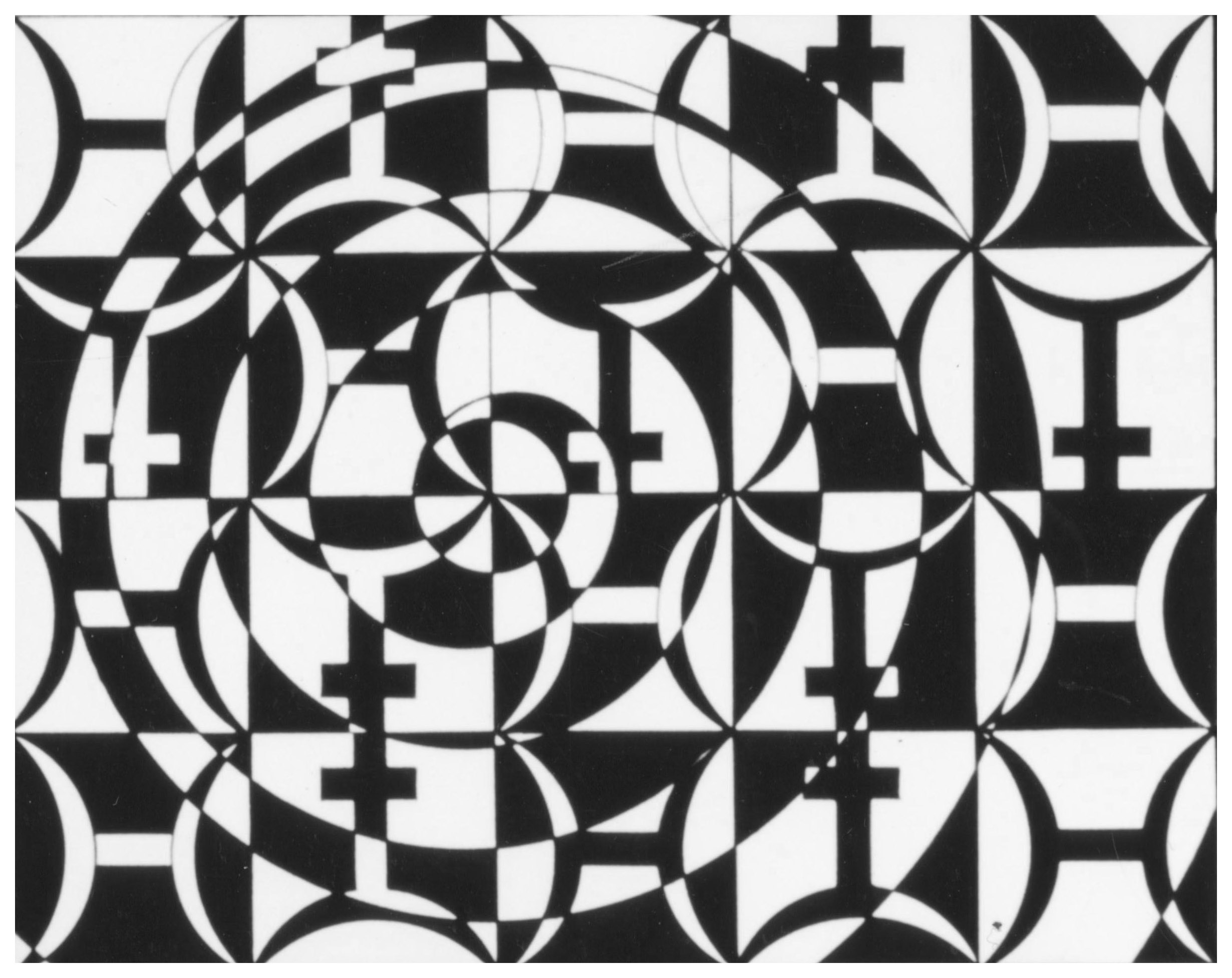
Penrose Tiling #1 explores visual complexity and perceptual rhythm. Rendered in oil on an oblong canvas, Penrose Tiling #1 is a tessellation of rhombus-shaped units arranged in a Penrose tiling—a non-periodic pattern. The composition overall resists repetition while maintaining structural coherence. One visual element of note is how the elongated horizontal format enhances the sense of spatial drift, as the eye navigates the interlocking forms and their directional cues. Continue reading “Penrose Tiling #1 (2013)”
This painting is not concerned with representing an object but is instead staging how vision itself negotiates space. Thus, the viewer is invited to experience shifting depth cues (is the center receding or projecting?); transparency versus opacity; and the instability of alignment and orientation.