Tracing the Contours of Art, Science, Technology and Cognitive Neuroscience
Category: Monochromatic
This section showcases monochromatic paintings and drawings. Since the purpose of this website is to archive Amy Ione’s work from the 1970s to the present, both successful and less successful work is displayed. For more information about any of the works, click on the caption below the painting or send an email.
Homage to Cézanne is actually based on how his approach to perceptual painting influenced my work, not Cézanne’s style. The photographs below are reference photos used. The face top left in the large drawing is Cèzanne’s. The figures on the left are based on various photographs of him. The origin of the faces on the right is unclear at this point. Continue reading “Homage to Cézanne (1987)”
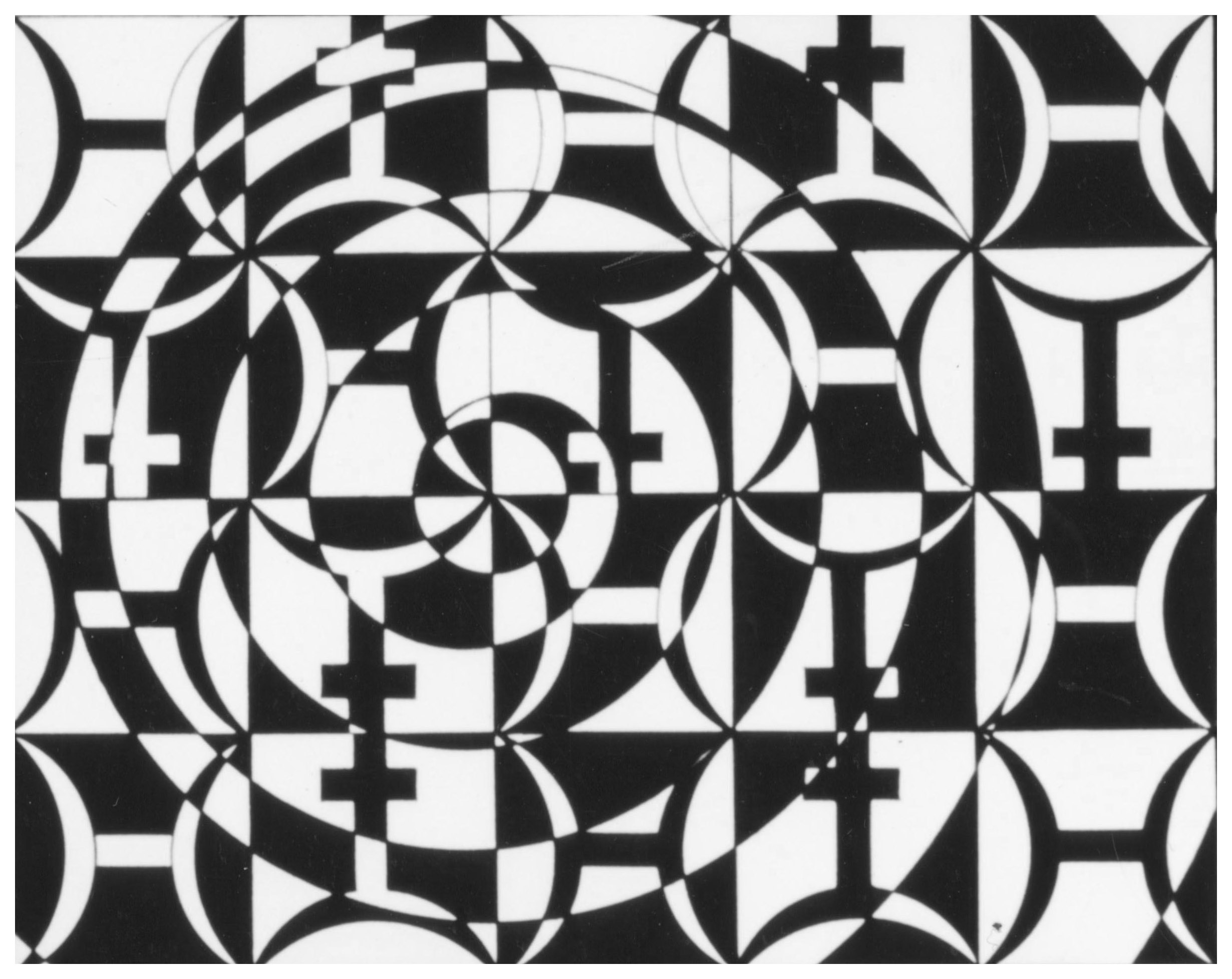
Pisces (1985) was a pivotal piece. It incorporates the Pisces symbol into the composition, and is not a narrative work in any way. Its vibrancy comes about due to the use of spirals and patterning—and it built on my discovering that creating lines with different sized pen widths added a perceptual musicality. This discovery is discussed on The First (Pisces)page.
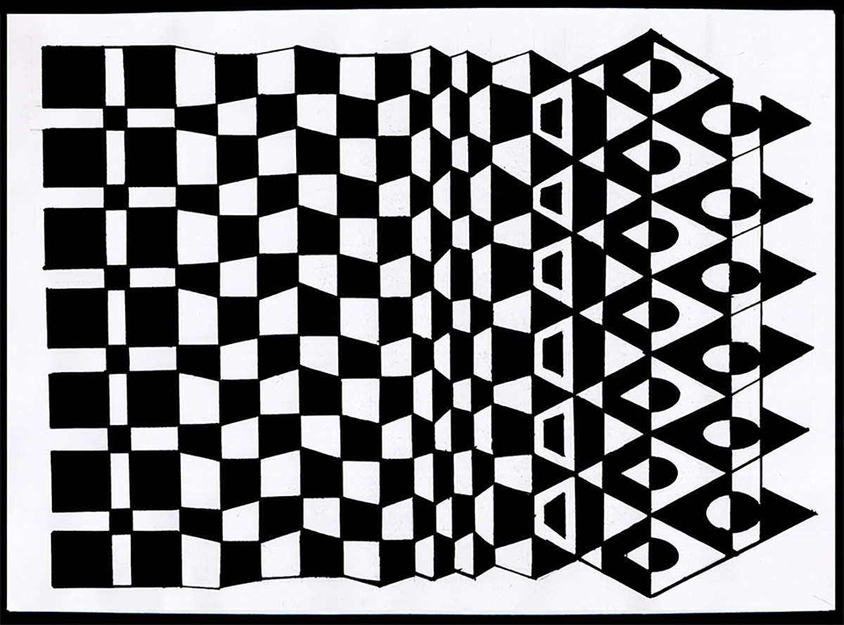
This small, intimate work foregrounds “mutation” as both subject and method. It began with a vertical line of squares and with slight changes on the vertical axis, the pattern was transformed into an open column of triangles at the end. Overall, the piece expresses a noticeable change in character, appearance, function or condition on a 2-dimensional plane; a metamorphosis that adds a perceptual dynamic to the black-and-white geometries. Continue reading “Mutation Study #1 (2018)”
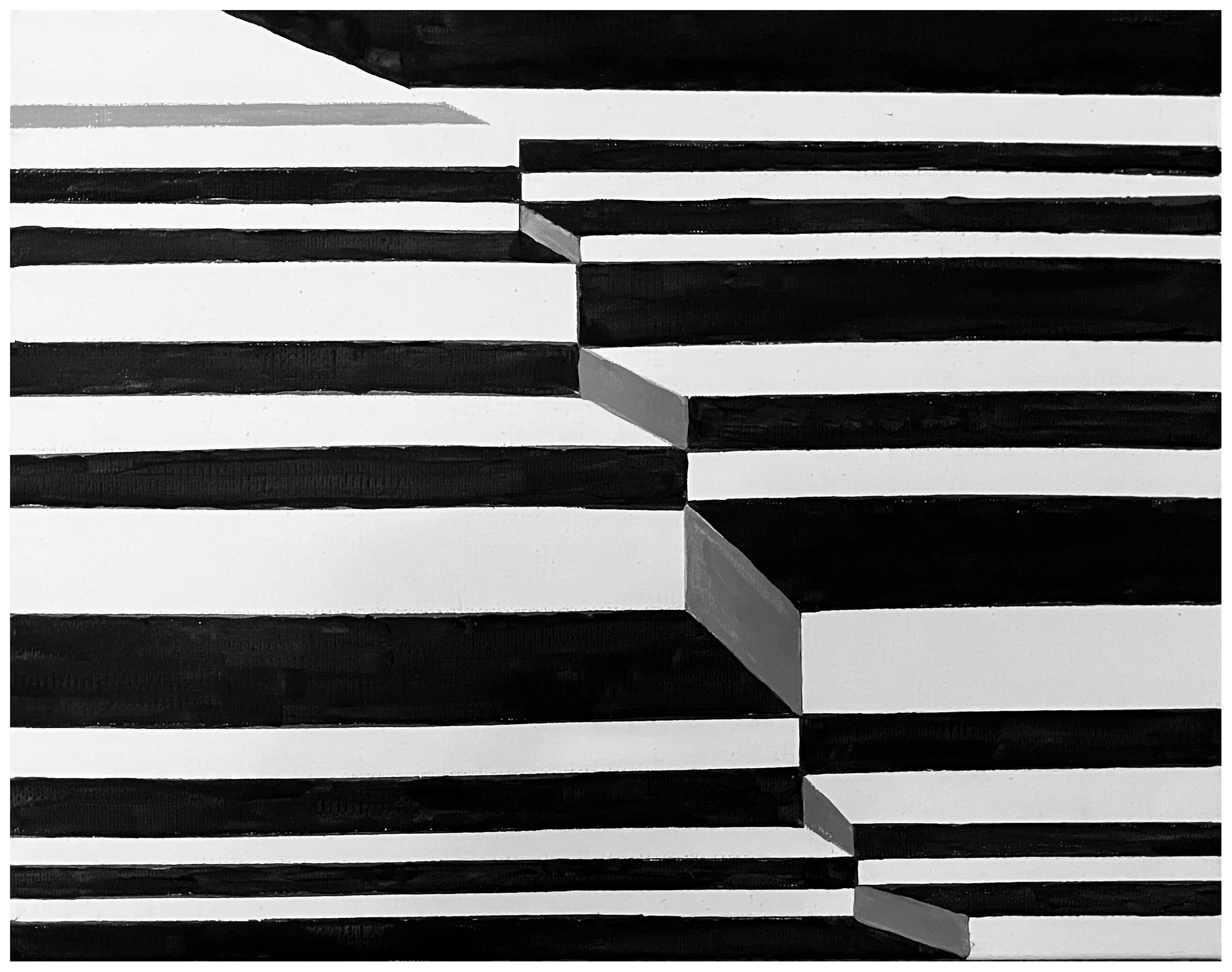
This is a perceptual experiment intended to convey the social dissonance in 2025. In it, the black, white and shades of gray play off the horizontal lines and a diagonal cue to create an optical illusion. At the same time, they point to the various ways in which life, society, and even ideas about what reality is are uncertain or unpredictable. Continue reading “Uncertainty and Dissonance (2025)”
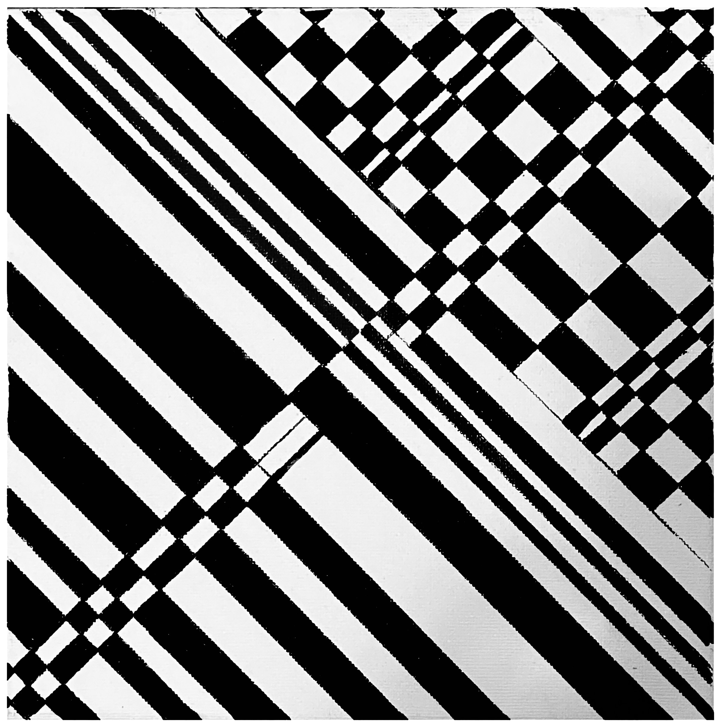
Adding Dynamic to a Black-and-White Grid transforms a basic pattern parallel lines into a vibrant exploration of movement and contrast, using only the fundamental opposites of black and white to make its statement. The contrast in this monochromatic work does not produce a rigid image because the bold introduction of diagonal and intersecting lines are used to add energy to what began as an very static form. Thus, the composition as a whole balances the uniformity and formal qualities of a simple pattern with the disruption, evolution, and transformation within human life. Continue reading “Adding Dynamic to Black-and-White Lines (2025)”
The intention of this card was to use the fold as a line in presenting a formal and irregular composition. In this sense, it conveys something that is stochastic, which is defined as the property of being well-described by a random probability distribution. Continue reading “Stochastic Checkerboard (Greeting Card) (2017)”
Ione, Amy. Composition in Black and White. 2021. Black and white study on paper. Measures 6.75×5 inches.
Framed in 8×10 white metal frame with archival white mat covered by plexi-glass. Ships with a certificate of authenticity. Signed and dated on the back by the artist. Colors: Red, Black, Pink, Gray and White. Handmade. Original Artwork. (#31865)
Like Pandemic Study #1, this evocative oil painting explores the interplay between darkness and illumination through a monochromatic palette. Using black and white only, the painting demonstrates how these contrasting values can generate an almost chromatic luminosity despite the absence of color. The composition investigates the optical phenomenon whereby white light contains the full visible spectrum, while challenging conventional notions of black as merely the absence of light. Continue reading “Pandemic Value Study #2”
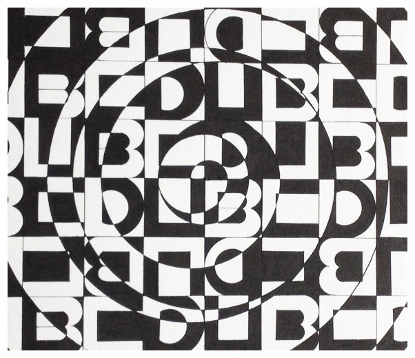
Like the 1985 Pisces, the concept behind this ink painting was a spiral constructed using a symbolic foundation, or more specifically in this work, a grapheme. A is the smallest functional unit of a writing system. As delineated here, the “C” stands for Christoper. Dub is a stand-in for “W”.
This evocative oil painting explores the interplay between darkness and illumination through a monochromatic palette. Using black and white only, the painting demonstrates how these contrasting values can generate an almost chromatic luminosity despite the absence of color. The composition investigates the optical phenomenon whereby white light contains the full visible spectrum, while challenging conventional notions of black as merely the absence of light. Continue reading “Pandemic Value Study #1 (2020)”