Cubistic (2017) is a Necker cube study. The work is a perceptual oil painting that explores visual ambiguity and cognitive interpretation through geometric abstraction. Its starting point was the concept of the Necker cube—an optical illusion first described by Swiss crystallographer Louis Albert Necker in 1832. Continue reading “Cubistic (2017)”
Pisces (1985) was a pivotal piece. It incorporates the Pisces symbol into the composition, and is not a narrative work in any way. Its vibrancy comes about due to the use of spirals and patterning—and it built on my discovering that creating lines with different sized pen widths added a perceptual musicality. This discovery is discussed on The First (Pisces)page.
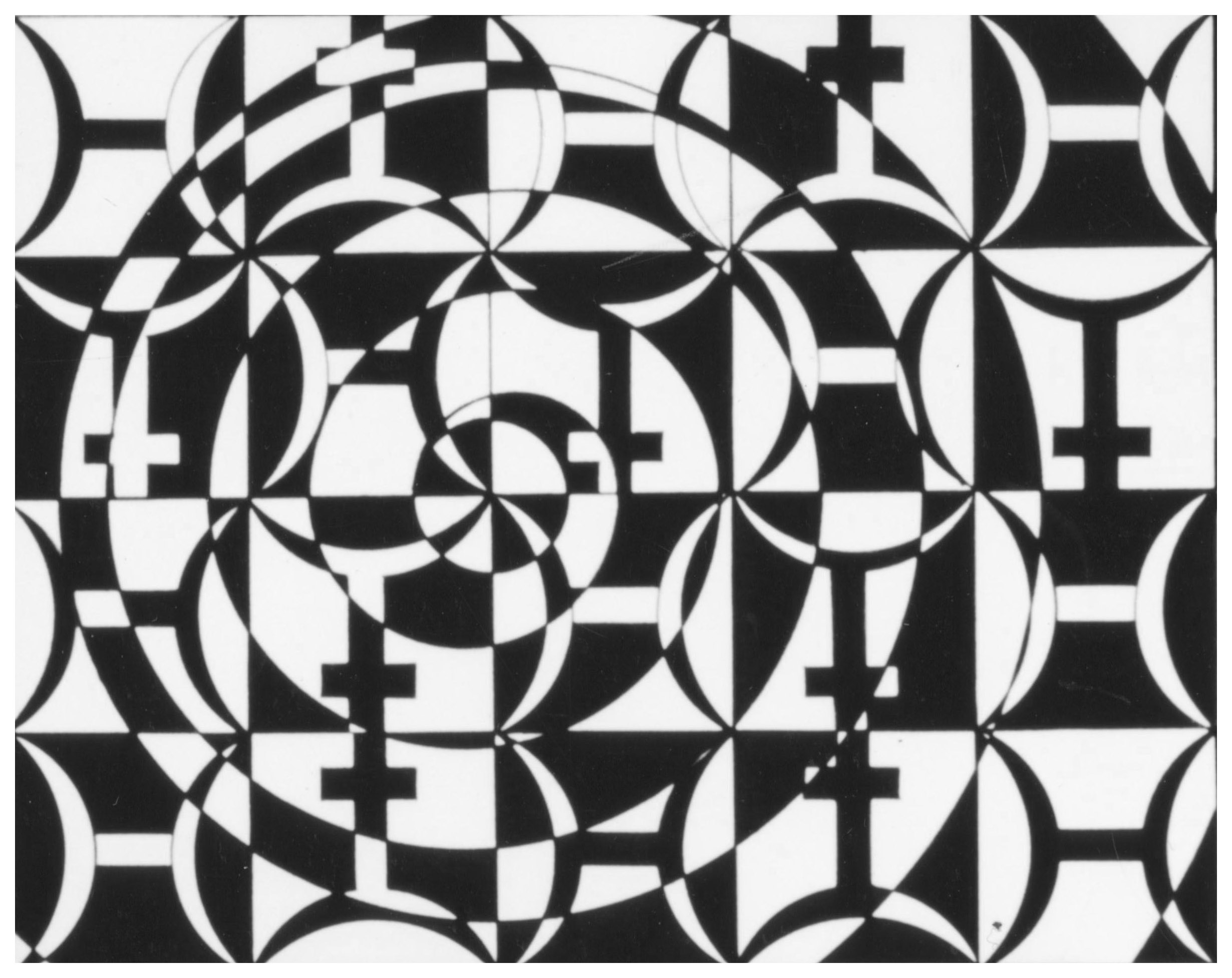
Reflections on Water #2 continues the perceptual inquiry begun in 1991 with the Reflections on Water #1 painting. It also shifts the emphasis by re-positioning transparency, overlay, and compositional variation.
Executed on hot-pressed watercolor paper, the second of the two Reflections on Water paintings was conceived on a smoother surface. Thus, it demanded a different approach: layered color washes and varied line widths create resonance without relying on textural grain. In other words, in Reflections on Water #2 the clarity and vibrancy derive from the controlled transparency of acrylic overlays, producing luminous effects that evoke water’s shifting reflections.
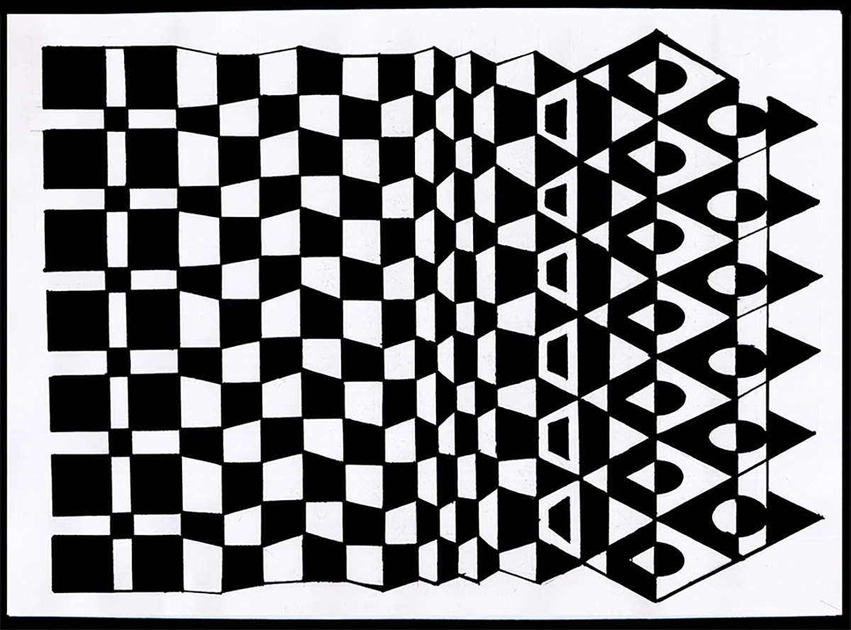
This small, intimate work foregrounds “mutation” as both subject and method. It began with a vertical line of squares and with slight changes on the vertical axis, the pattern was transformed into an open column of triangles at the end. Overall, the piece expresses a noticeable change in character, appearance, function or condition on a 2-dimensional plane; a metamorphosis that adds a perceptual dynamic to the black-and-white geometries. Continue reading “Mutation Study #1 (2018)”
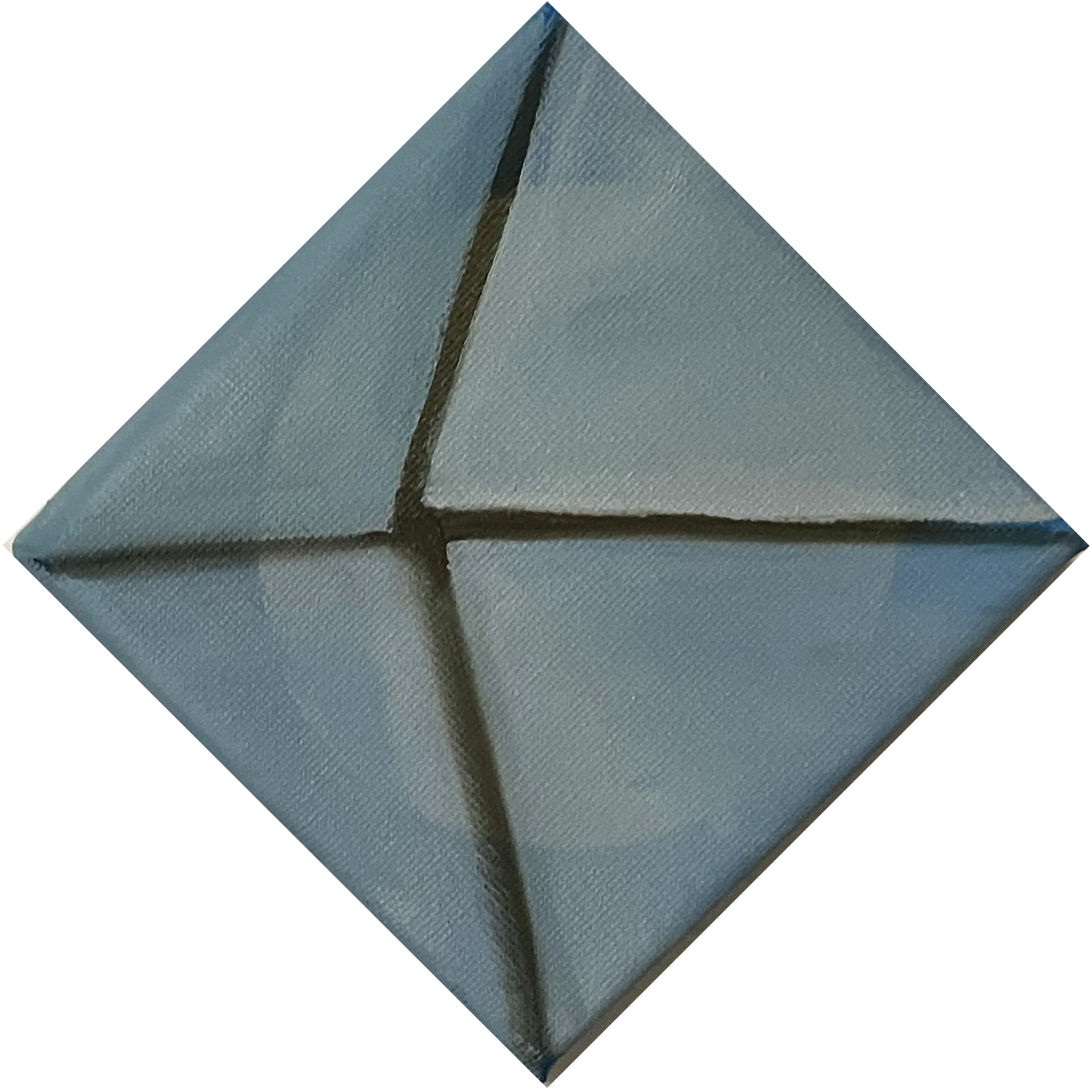
This small-scale sketch is a minimalist compositional sketch that explores perceptual ambiguity through geometric division and tonal modulation. It is expressive of my interest in how the brain processes visual stimuli. On this piece four triangular sections converge toward an off-center point creating a dynamic tension between symmetry and depth. The resulting percept is a folded illusion that evokes origami, architectural drafting, and geometrical syntax. At first glance some people see the lines going inward, while others perceive an outward projection. Longer engagement will result in seeing both possibilities. Continue reading “Sketch for Counterpoint #1 (2025)”
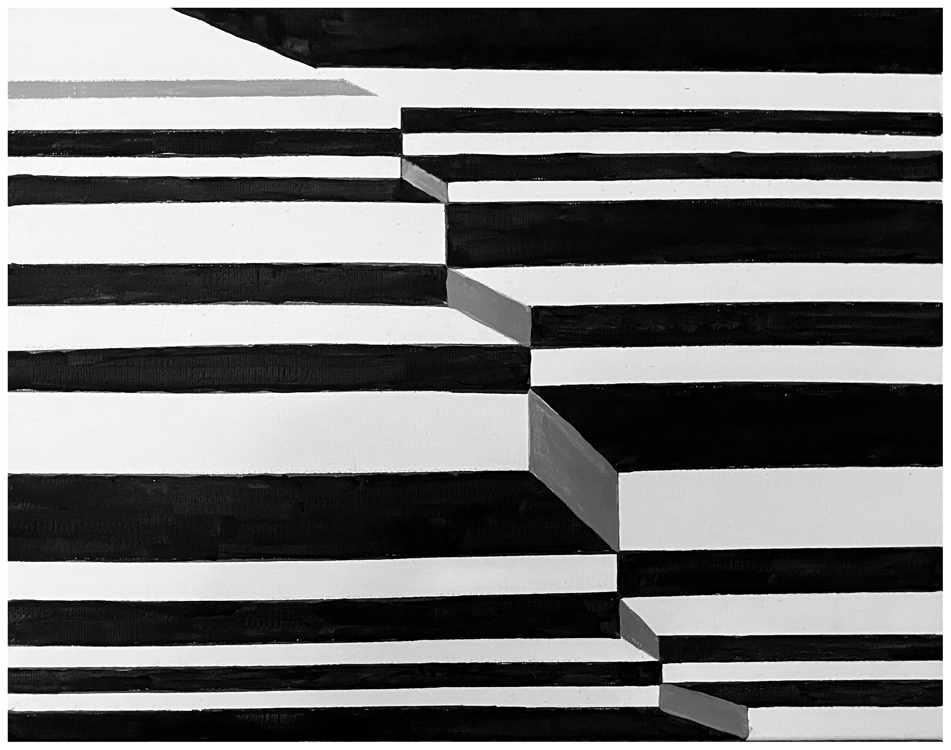
This is a perceptual experiment intended to convey the social dissonance in 2025. In it, the black, white and shades of gray play off the horizontal lines and a diagonal cue to create an optical illusion. At the same time, they point to the various ways in which life, society, and even ideas about what reality is are uncertain or unpredictable. Continue reading “Uncertainty and Dissonance (2025)”
Space Study #1 exemplifies my ongoing investigation into the intersection of art, science, and visual cognition. The painting’s layered hues—derived from a limited palette of red, green, and white—demonstrate how subtle shifts in chromatic balance can generate a sense of depth and spatial ambiguity. Continue reading “Space Study #1 (2002)”
Reflections on Water #1 is a seductive exploration of perceptual resonance achieved through the interplay of intuitive gesture and technological precision. Executed on rough watercolor paper, the surface’s tooth resists smooth application, producing a grainy, expressive texture. Using templates to compose the airbrush overlays, and combining this with ink linework, emphasized the tension between fluidity and structure. The painting’s vibrancy emerges from the uneven absorption of pigment, which creates shimmering effects akin to water’s reflective qualities. Thus, overall, the work embodies a dialogue between material resistance and artistic control, situating it within late 20th-century explorations of perception and surface.
Gradations and Imperfections is a circular panel animated by a dynamic checkerboard pattern, rendered in a palette of rich blue and creamy beige squares. Perceptually, it’s diagonal grid evokes a sense of movement and playful disruption. Each square and stripe varies subtly in hue and texture, inviting close examination of the painting’s hand-painted qualities. Continue reading “Gradations and Imperfections (2025)”
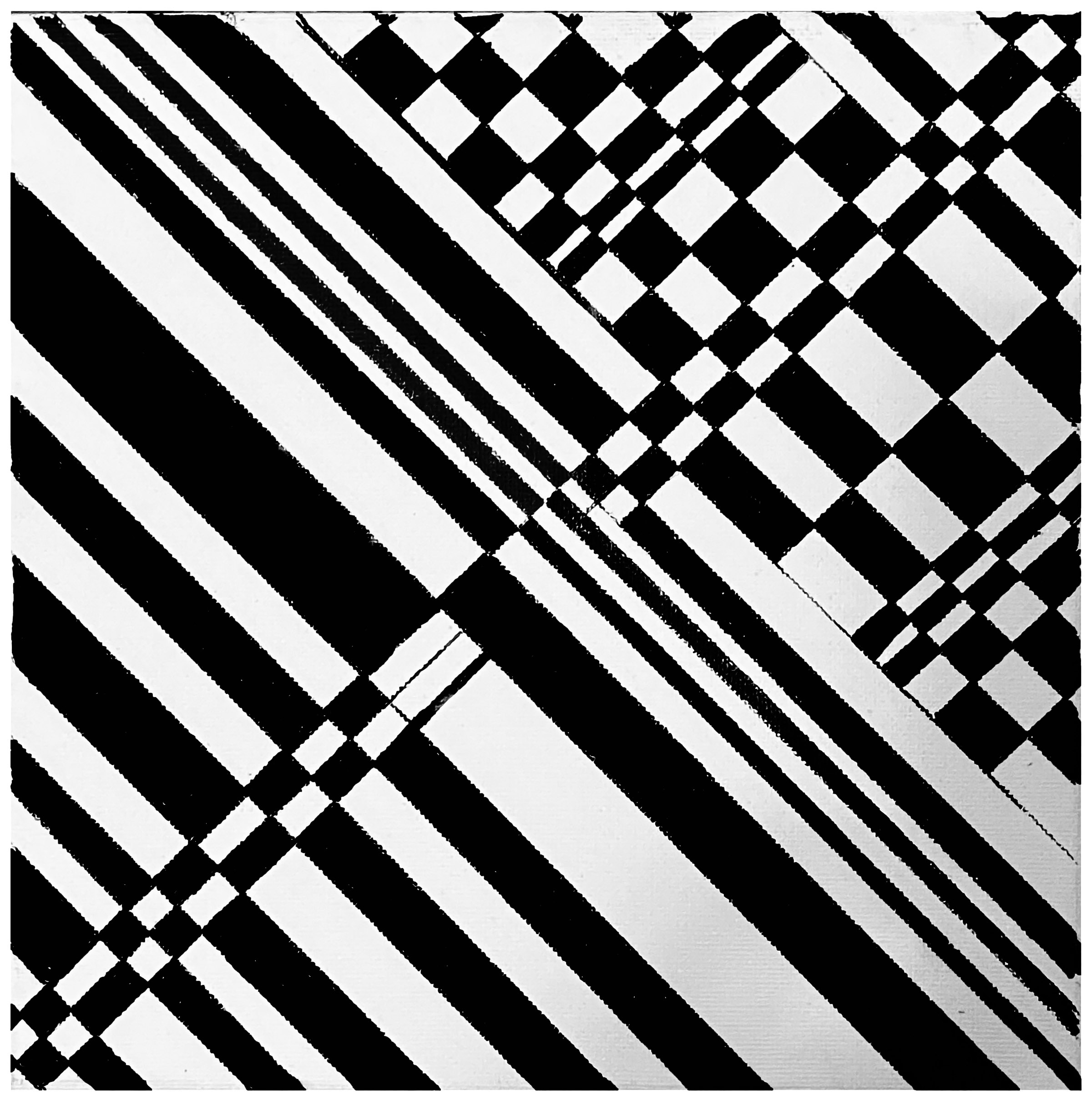
Adding Dynamic to a Black-and-White Grid transforms a basic pattern parallel lines into a vibrant exploration of movement and contrast, using only the fundamental opposites of black and white to make its statement. The contrast in this monochromatic work does not produce a rigid image because the bold introduction of diagonal and intersecting lines are used to add energy to what began as an very static form. Thus, the composition as a whole balances the uniformity and formal qualities of a simple pattern with the disruption, evolution, and transformation within human life. Continue reading “Adding Dynamic to Black-and-White Lines (2025)”