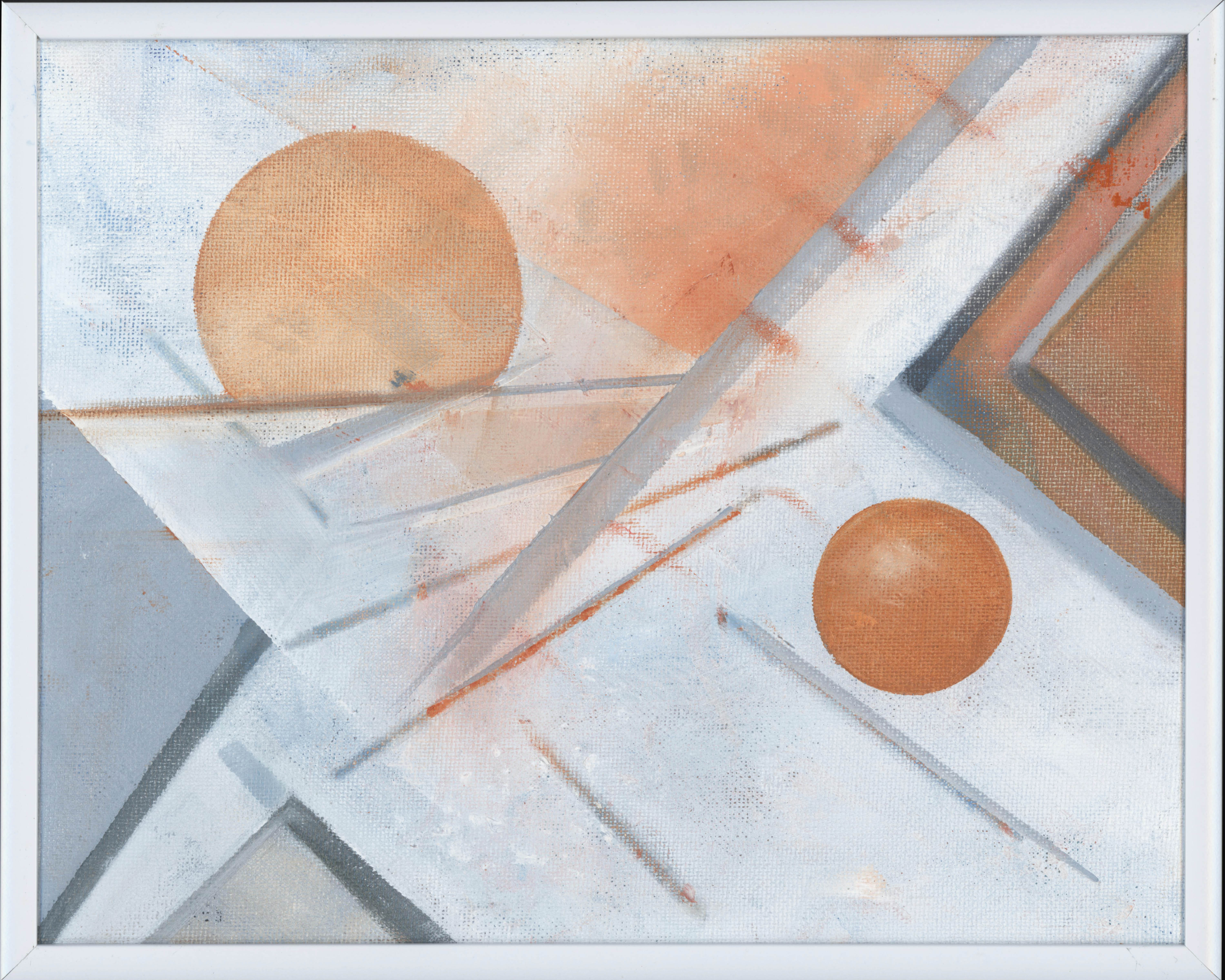
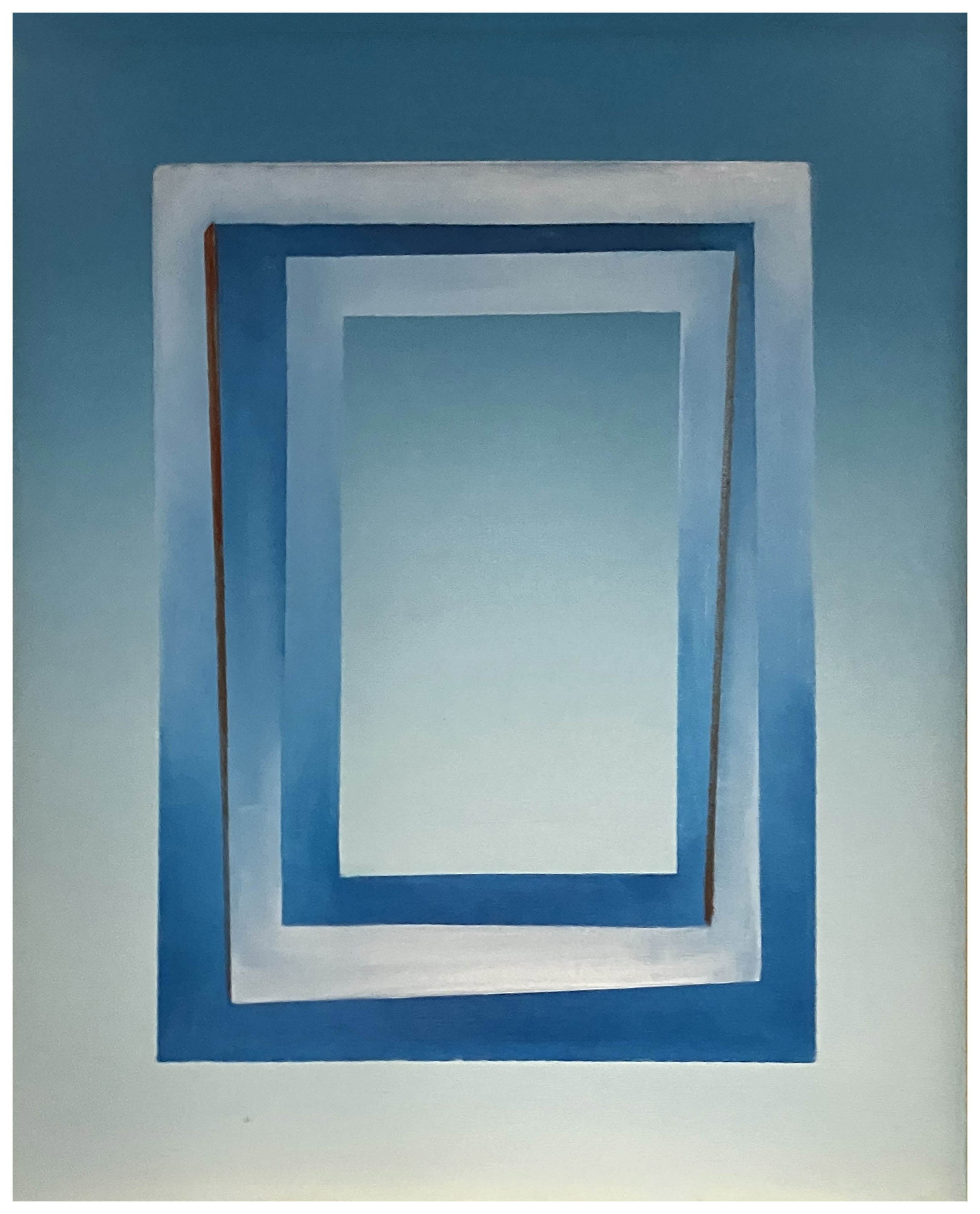
Reflections on Water #2 continues the perceptual inquiry begun in 1991 with the Reflections on Water #1 and the 1992 Reflections on Water #2 paintings. The earlier paintings emphasized transparency, overlay, and compositional variation using water-based paints and an airbrush. This rendition used oil paint and a wood panel.
This red, white, and blue abstraction captures the wonder and excitement of fireworks, with the viewer’s imagination adding the sensory details. Note that the black in the painting serves to denote how a black sky, a part of a fireworks celebration, helps in creating the awe-inspiring experience. Continue reading “Fourth of July (2023)”
Space Study #2 (2002) began as a simple spiral but evolved over time into a more vital and animated surface. Its foundational elements are the spiral, the texture of the masonite board, and the pairing of cadmium orange and ultramarine blue. Complementary colors, the orange and blue emerge as a chromatic opposition that generates vibrancy and depth. Continue reading “Space Study #2 (2002)”
This work is another example of my examination of perceptual ambiguity through geometric abstraction with its diagonal thrust and dual circular anchors generating a visual rhythm that suggests both motion and equilibrium. Diagonal lines and dual circular forms animate this composition, creating a sense of tilt and tension. Continue reading “Slope (2022)”
The Mirror is a compelling meditation on visual cognition and the layered nature of perception. Dominated by a central white orb—reminiscent of both a mirror and an eye—the painting orchestrates a dynamic tension between structure and spontaneity. Angular lines slice through the composition, while expressive brushstrokes in slate gray, red, and blue punctuate the surface, evoking both emotional resonance and neural complexity.
Notations’ dynamic brings together spherical, triangular, and linear elements, The composition pivots on the interplay of fiery oranges and reds that suggest motion or transformation. Counterbalanced by blues, there is a contrast that both divide and activates the Masonite surface. This push and pull rhythm also propels the eye across the surface. Continue reading “Notations (2022)”
Although black, white and shades of grey, this painting was inspired by Josef Albers’ studies of color relationships, thus the name: Homage to Josef Albers.
Albers (1888-1976), a German-born American artist and educator who is considered one of the most influential 20th-century art teachers in the United States.
Perceptual Study: Rectangular Abstraction in Blue, White, and Red (2015) uses a limited palette and rectilinear structure to explore how viewers perceive depth, rhythm, and spatial tension within a flat surface. It belongs to my series of “perceptual studies,” works that treat the canvas as a site for investigating visual cognition rather than for depicting recognizable objects.
This large-scale oil painting speaks to a mastery of layered composition and chromatic complexity developed over time. The substantial dimensions of the canvas provide an immersive visual experience, while the layering creates both depth and movement across the picture plane. Continue reading “South Africa (2021)”